


THE CHALLENGE
The aim of this project was to preserve and control the consistency of the existing Asia Street cooking Ltd. across all communication materials. As a variety of units under the same name were being developed, the client started seeing discrepancy and inconsistencies in execution.
Together we developed a manual that provides an overview of both inside and outside retail communication touch points by setting distinctive visual equities and their uses (i.e. logo, font, colors, illustrations, etc.).
THE STORY
Soul of the east, streets of the world.
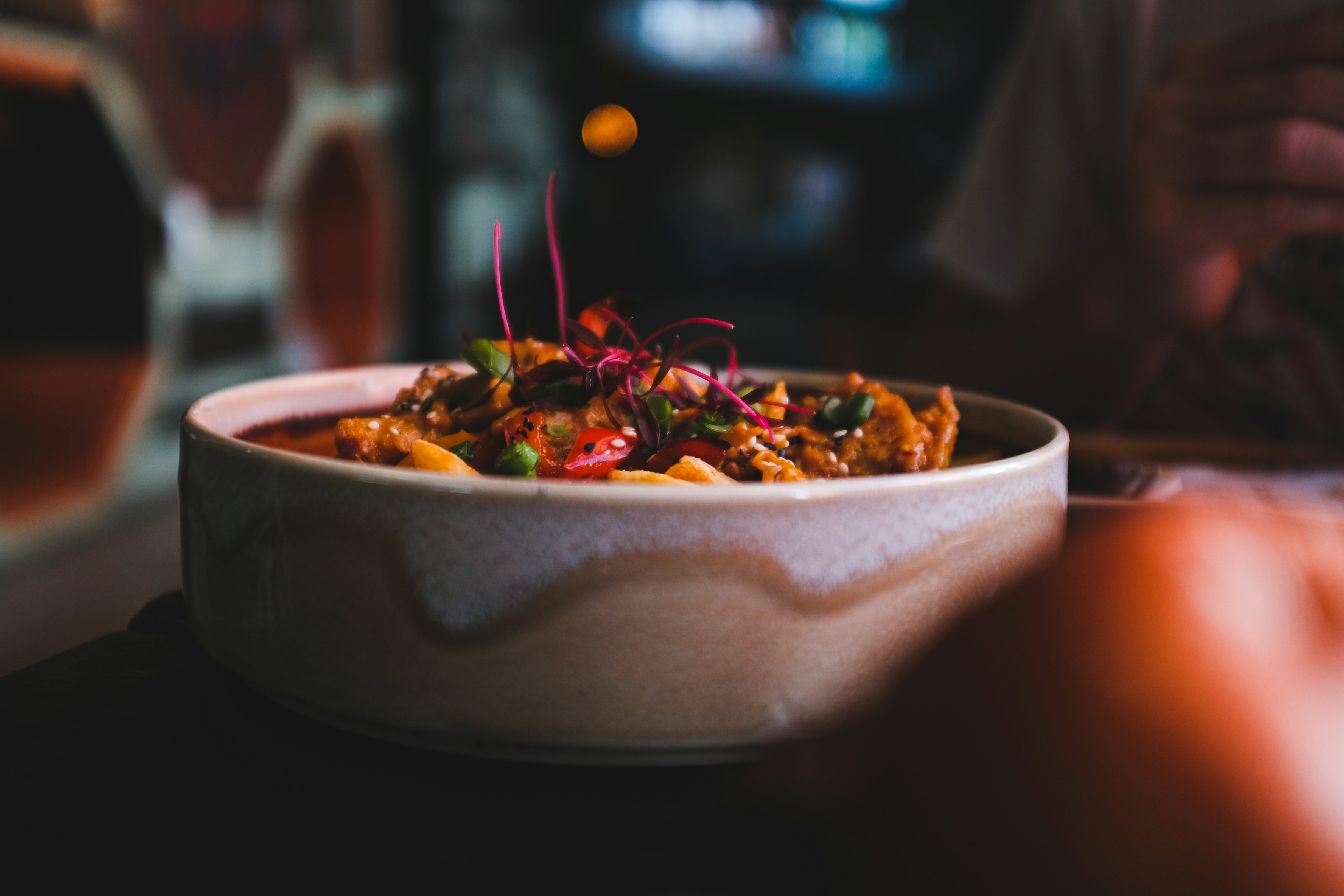
Learnt from the street, and fashioned for a high volume restaurant setting, Asia street is a concept that meets the Western palates, with a distinct Eastern spice. It delivers on a high variety menu with international appeal. A mix and match from pop-culture of different Asian countries that remain true to traditional flavors, but presented in a unique and quirky way.
The “coordinated clash” of all the restaurant areas, creates an authentic and dynamic “Asian street” atmosphere, bringing the hustle and bustle of an alley from the far east, to the world stage of global travelers. The soul of the Orient is merged into a modern experience, an original and casual destination fitting for a diverse audience, that showcases a fusion of authentic flavors - Thai, Vietnamese, Chinese, Korean.


REBUILDING THE BRAND
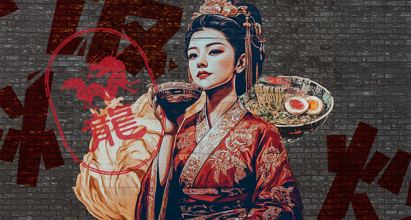
The logo for the unit was already designed, but needed to be aligned with the eclectic and multicultural identity of the unit. We started by researching elements and iconography from different cultures of the east, and translated them in a system based on symbols and typography targeted to a western market, but representative of the streets of the most eastern corners of the world.


VISUAL IDENTITY
The visual identity was developed as an extension of the concept wide culinary and cultural reach, bringing together graphic elements, and symbols from different countries under the common roof of unpretentious street dining. From the menus on the table to the murals on the walls everything was designed following the strict rule of “no-rules”, blending together pictograms from different languages, vintage imagery, modern typography and stylized food illustrations, to create a unique and powerful brand experience.


Asia Street Cooking
Brand Identity
Visual Identity
Signage & Packaging
Merchandise
In-store art