


THE CHALLENGE
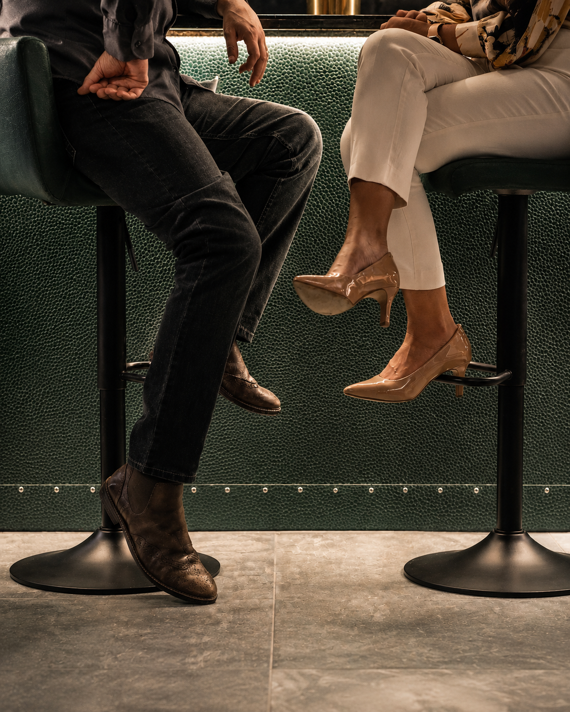
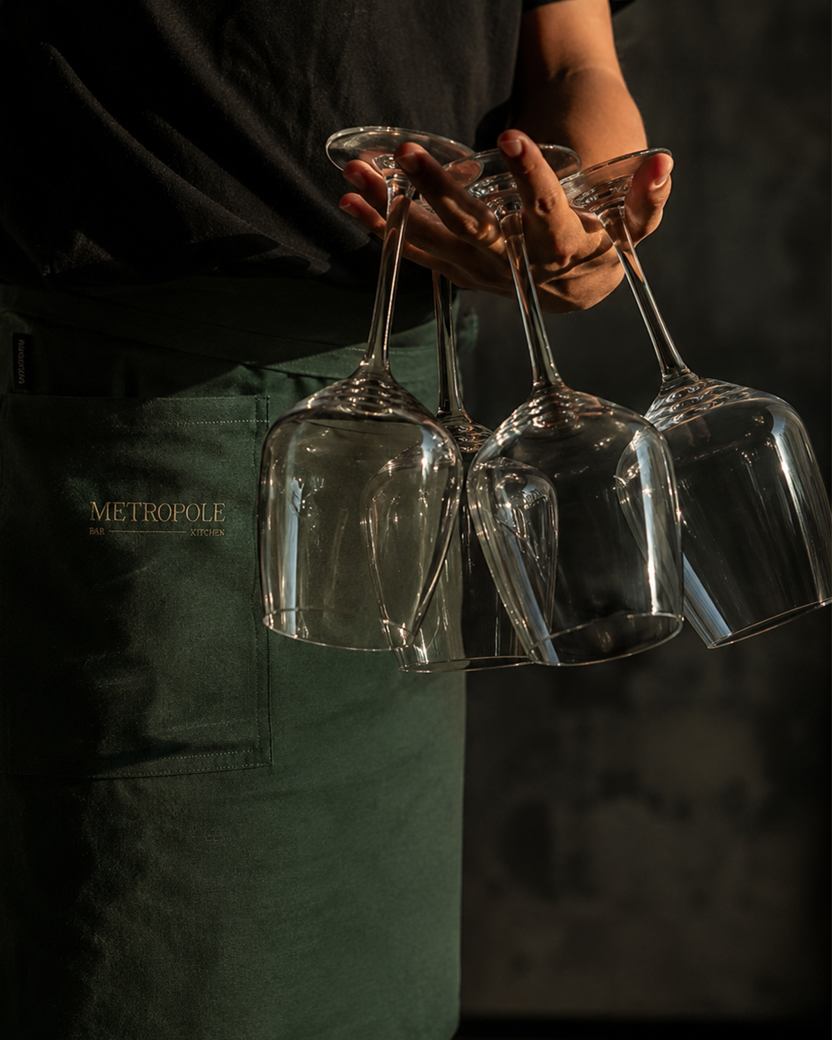
The scope of the project wass to create a brief visual identity for “Metropole” that expanded the distinctive design of the unit and bridges the gap between the heritage and modernity of Rotterdam as a city. The goal was to create a modern, welcoming bar experience that elevates the offer from the surrounding concepts, while still be approachable and comforting for all travelers.
As interior design and concept brief had already been established for the unit, the Identity needed to complement the defined palette, atmosphere and existing design elements, as well as be a suitable backfield for the presence of Heineken products and promotions.
VISUAL INSPIRATION
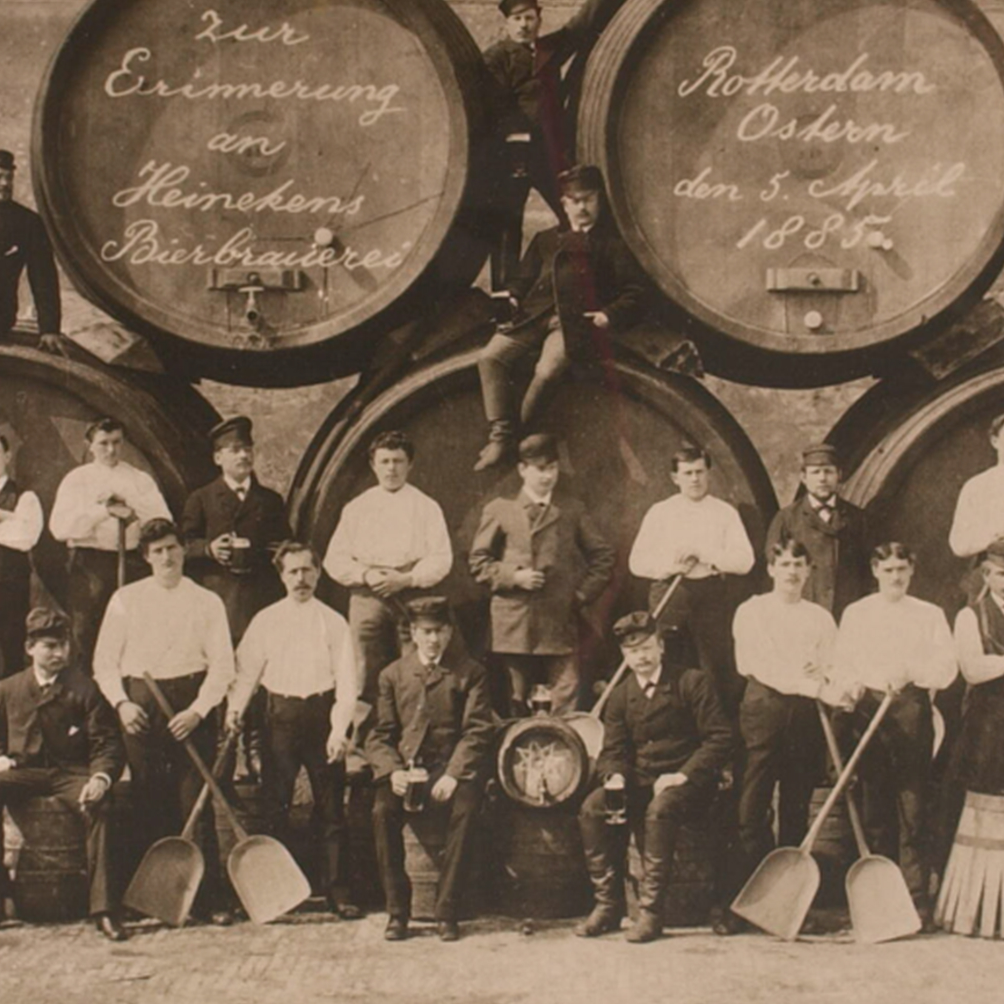
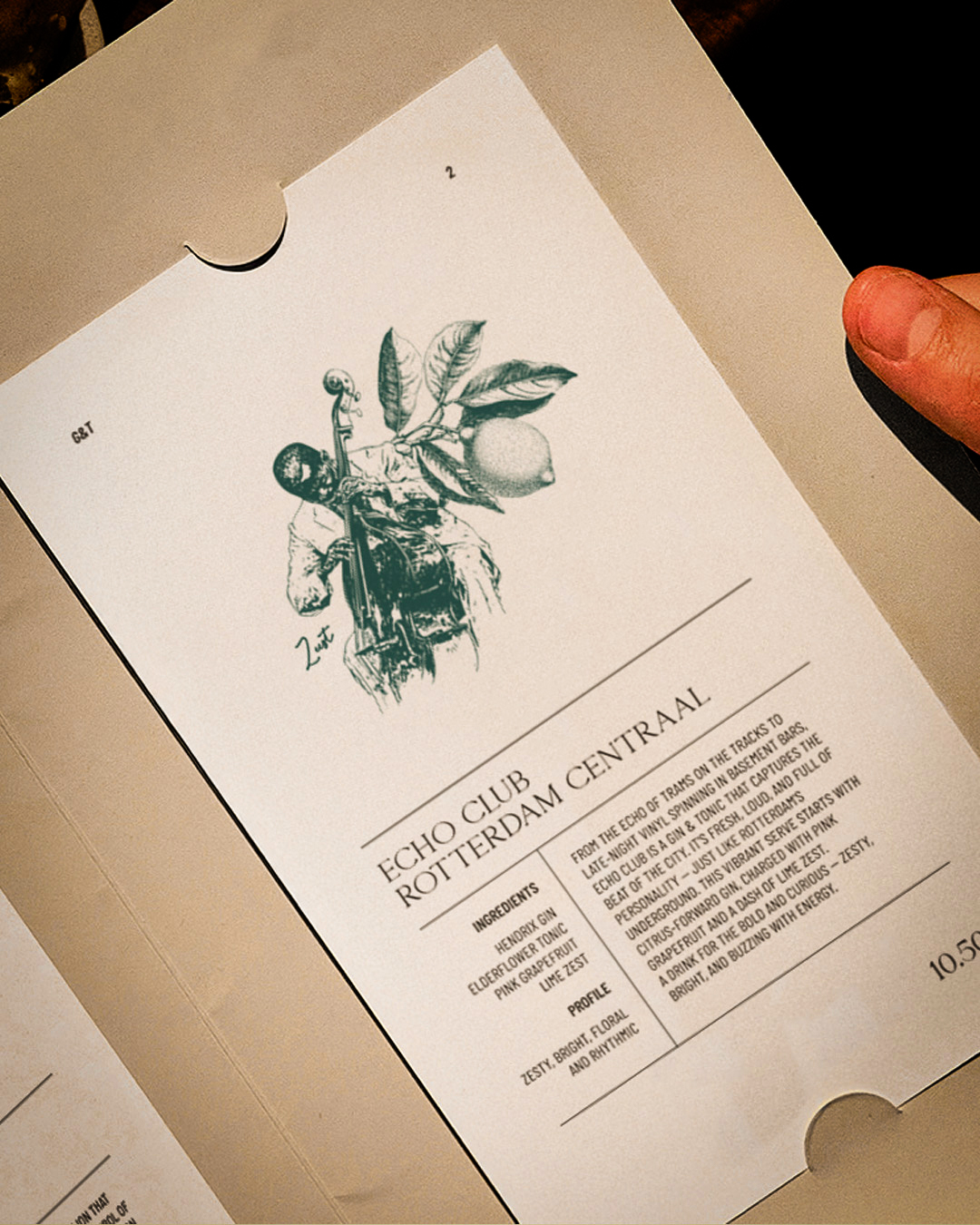
Metropole’s visual identity blends heritage and modernity through a deliberately eclectic lens, just like the city itself. The typography is drawn from old harbor annals, evoking the clarity and utility of Rotterdam’s maritime past, reinterpreted with a refined, contemporary edge.The imagery takes cues from traditional woodcut styles, reimagining both historic and modern subjects (from sailors to street musicians) as bold, tactile illustrations.
Altogether, the identity reflects the layered personality of the city, a celebration of its workers, artists, and everyday characters, brought together through contrasts: comforting and loud, crafted and raw, serious and full of life.


VISUAL IDENTITY
The imagery system at Metropole is designed to be instantly recognisable and emotionally rich — a visual language that speaks to the soul of Rotterdam. Each composition is built using a woodcut-inspired illustration style, blending historic and contemporary subjects. This handcrafted, tactile aesthetic connects back to the city’s working roots — the dockworkers, artists, migrants, and everyday characters who shaped Rotterdam’s cultural identity.
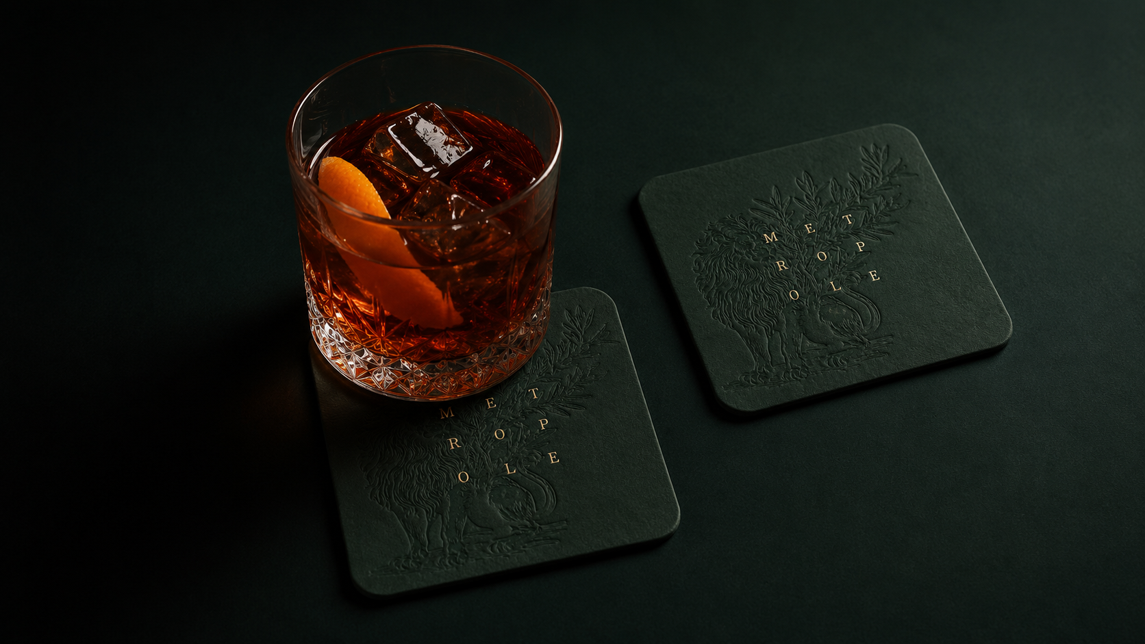
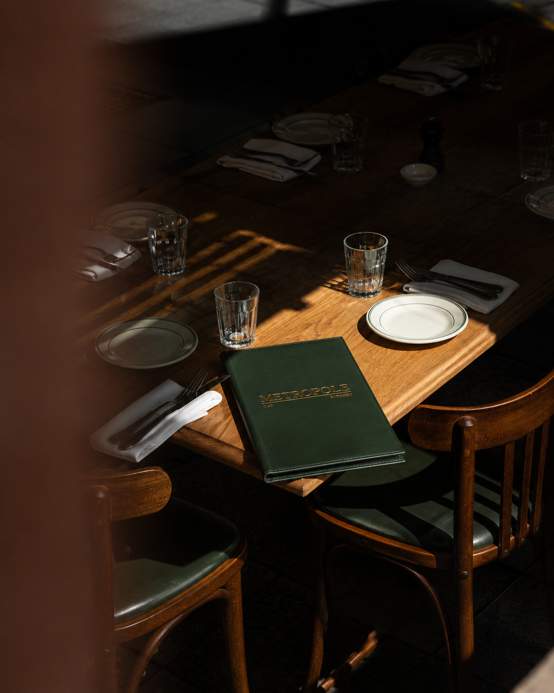
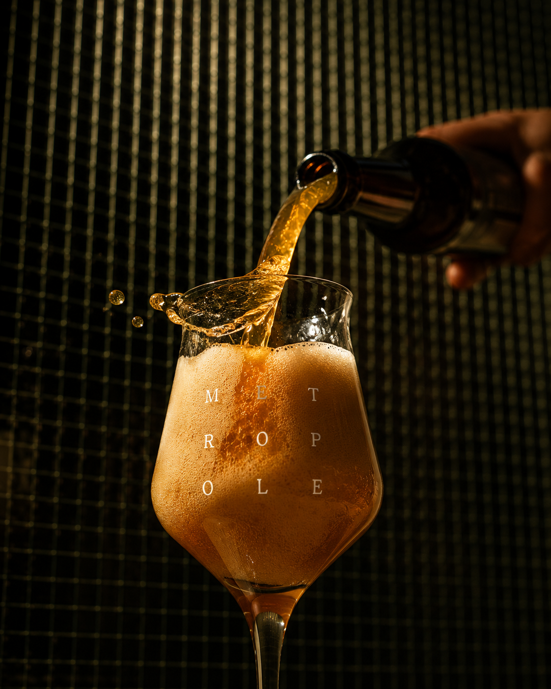

Metropole
Visual Identity
Signage & Collaterals